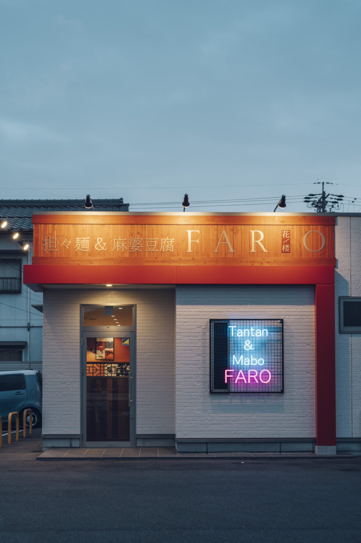
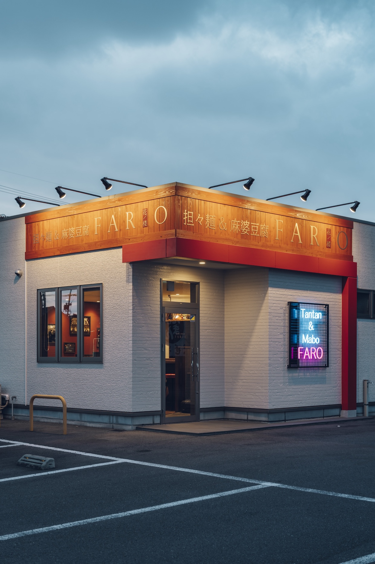
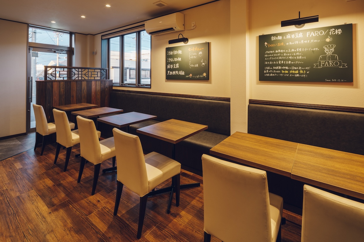
FARO-花楼- 小牧弥生町店
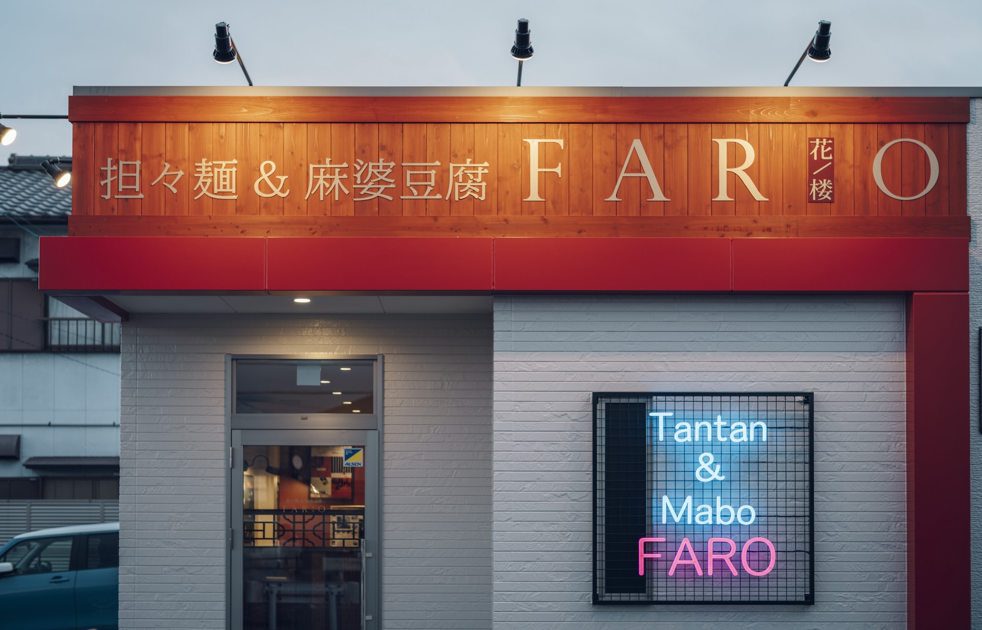
第1号店もデザインさせていただいたチャイニーズレストランの2号店。
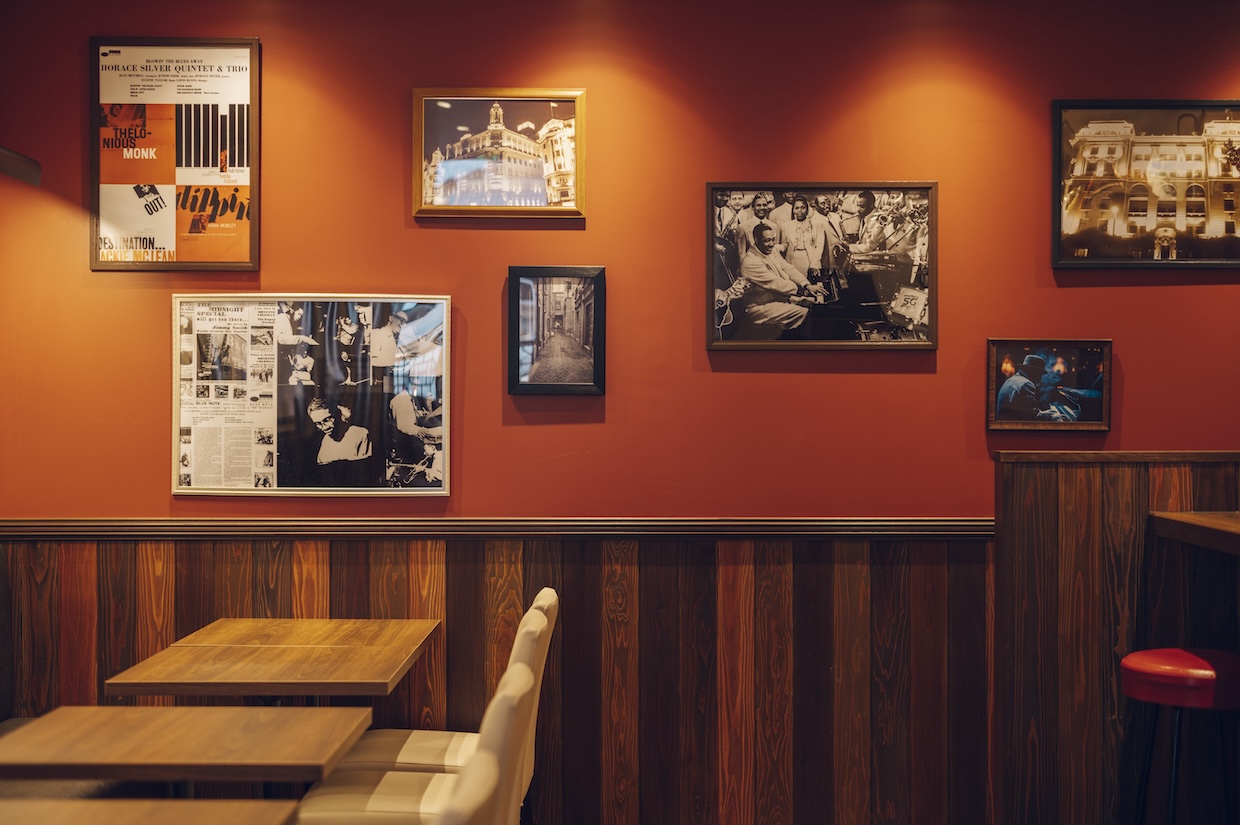
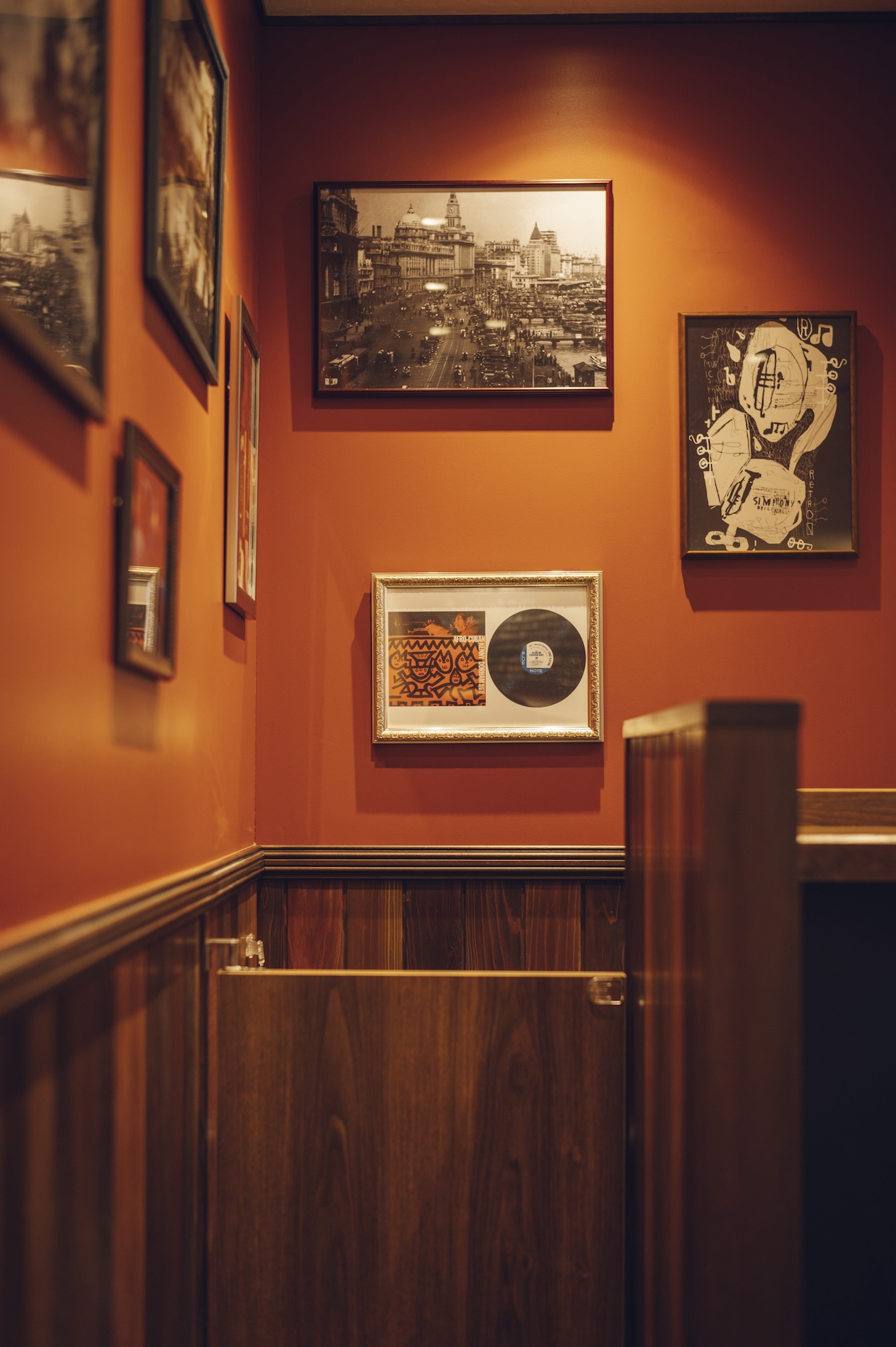
~1920年、疎開時代の上海。その裏通りにあった小さな食堂~
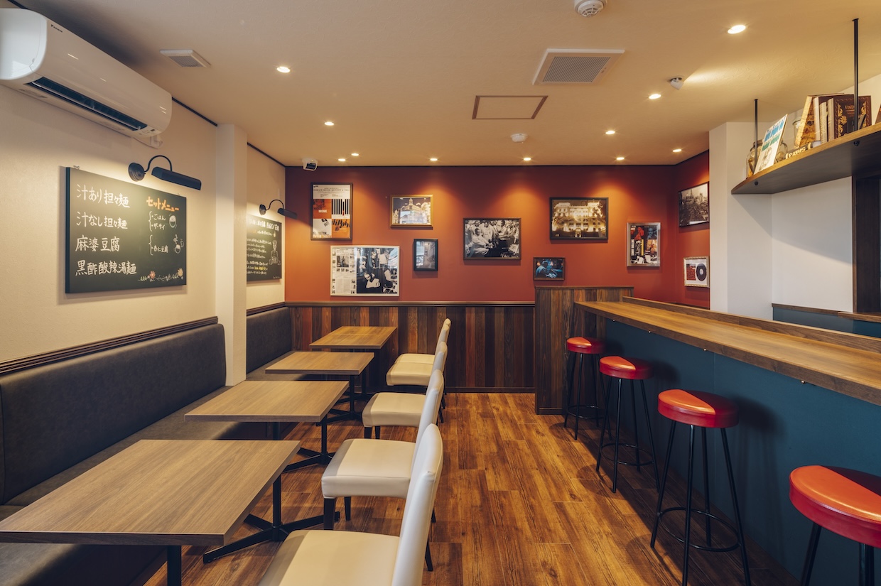
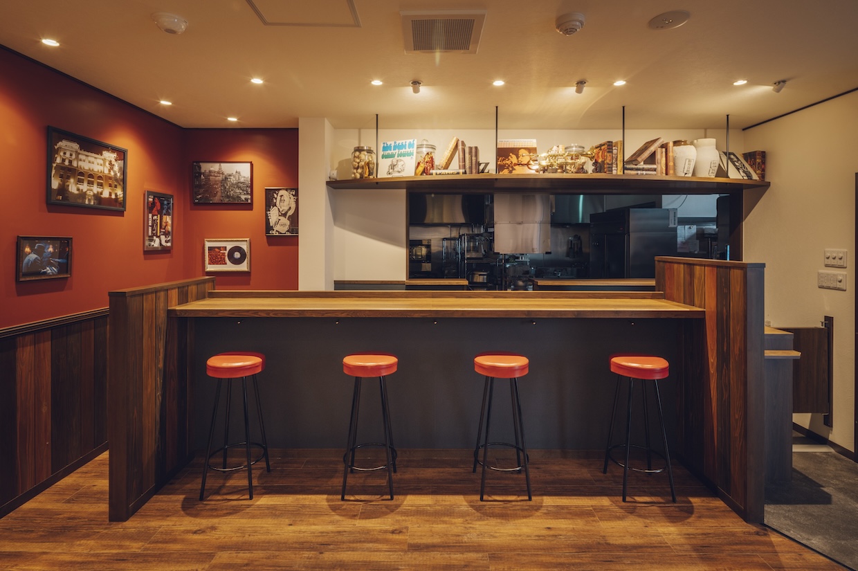
1号店のコンセプトをそのまま引き継ぎ、
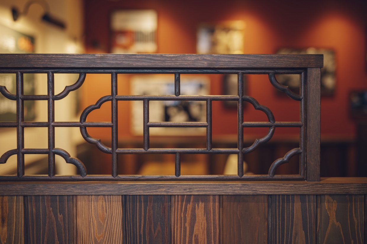
キーカラーの赤色、ネオンサイン、店内を流れるスイングジャズ、ディスプレイなど
1号店を連想させるデザインにしました。
また今回は交通量の多い路面店なので車からも見えやすいサイン計画も取り入れ
見かけたらついつい立ち寄ってしまいたくなる、そんなお店になりました。
![](https://rojak.jp/cms/wp-content/uploads/vgwsC-scaled-e1736475735456.jpeg)
![](https://rojak.jp/cms/wp-content/uploads/L1021857.jpg)
![](https://rojak.jp/cms/wp-content/uploads/L1021816.jpg)
![](https://rojak.jp/cms/wp-content/uploads/L1021829.jpg)
![](https://rojak.jp/cms/wp-content/uploads/L1021834.jpg)
![](https://rojak.jp/cms/wp-content/uploads/L1021839.jpg)
![](https://rojak.jp/cms/wp-content/uploads/L1021843.jpg)
![](https://rojak.jp/cms/wp-content/uploads/L1021846.jpg)
![](https://rojak.jp/cms/wp-content/uploads/L1021813.jpg)
![](https://rojak.jp/cms/wp-content/uploads/L1021858.jpg)