五幸商事 展示会
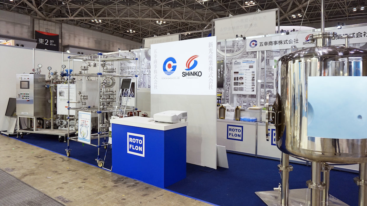
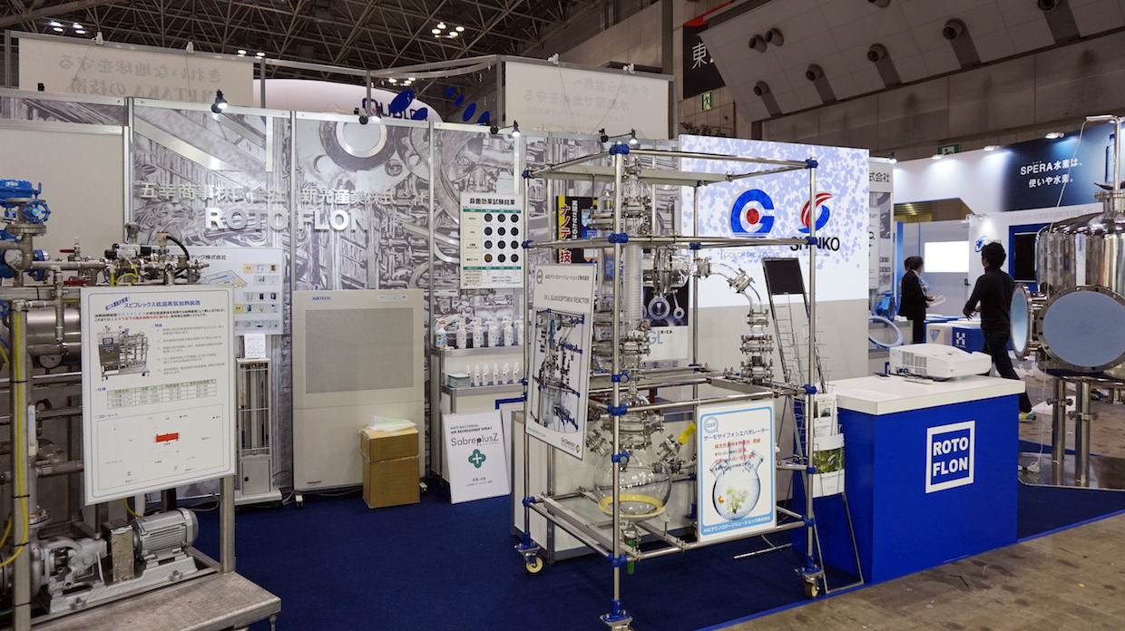
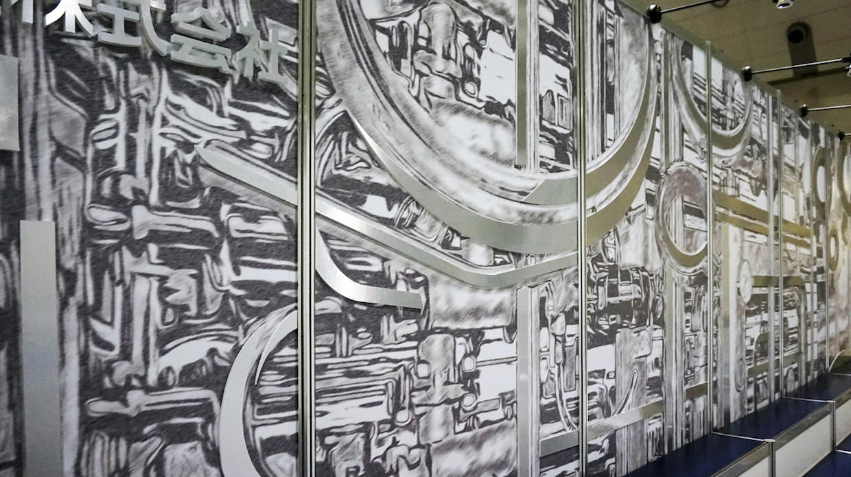
展示会というシチュエーションを考慮の上、数ある企業の中から、
製品が引き立ち且つ他社との差別化が図れるご提案を心がけました。
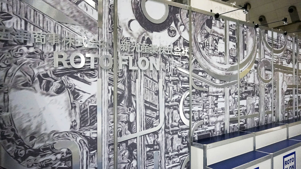
カラーリングは企業カラーのブルーをベースにレイアウト。
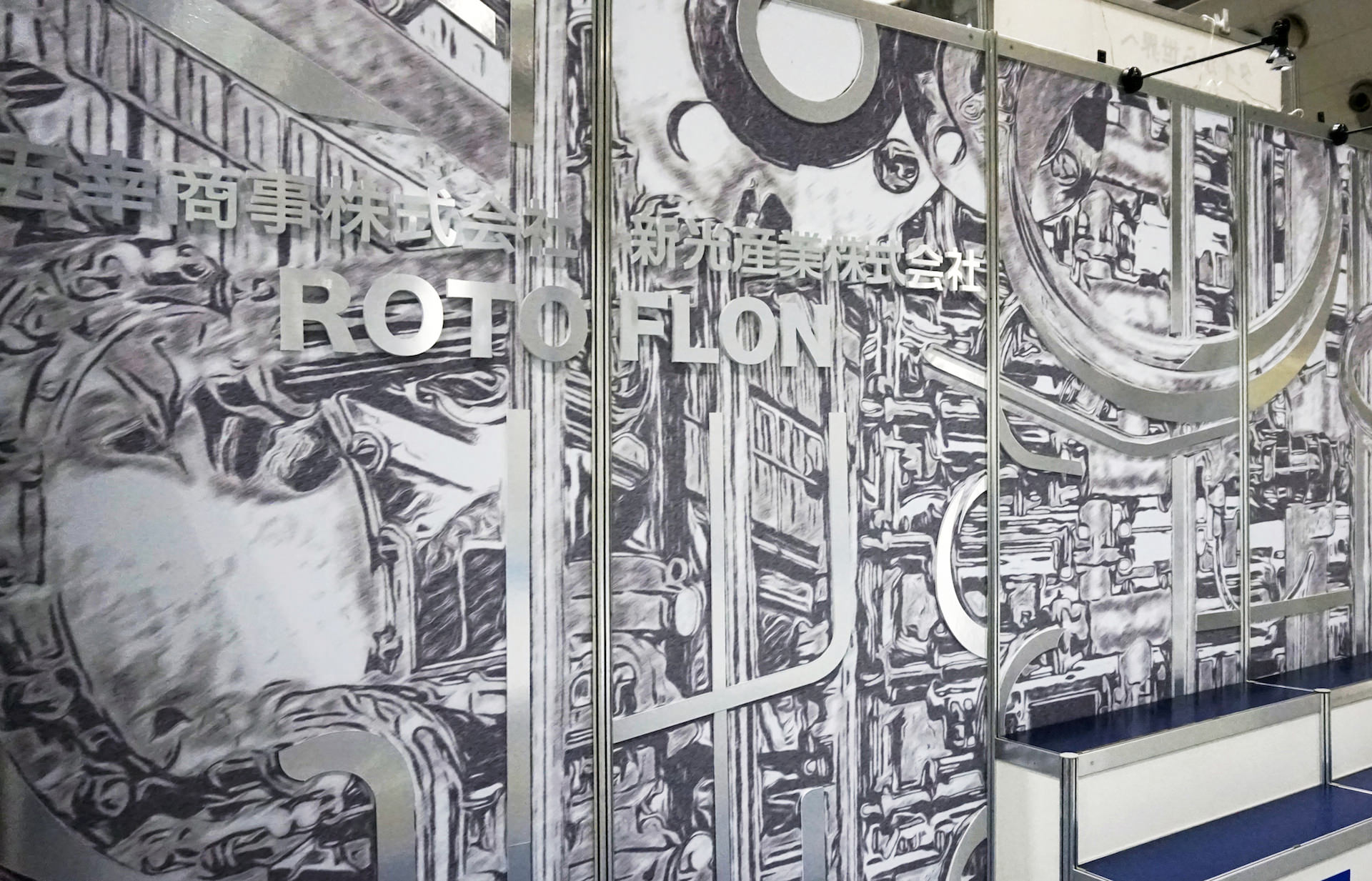
バック壁面には製品をイメージさせるグラフィックデザインを、
ポイントでステンレス板を貼り付け、素材感を表現しました。
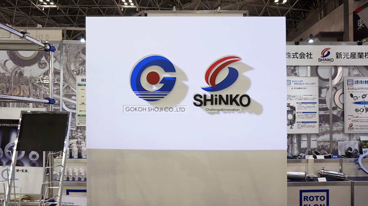
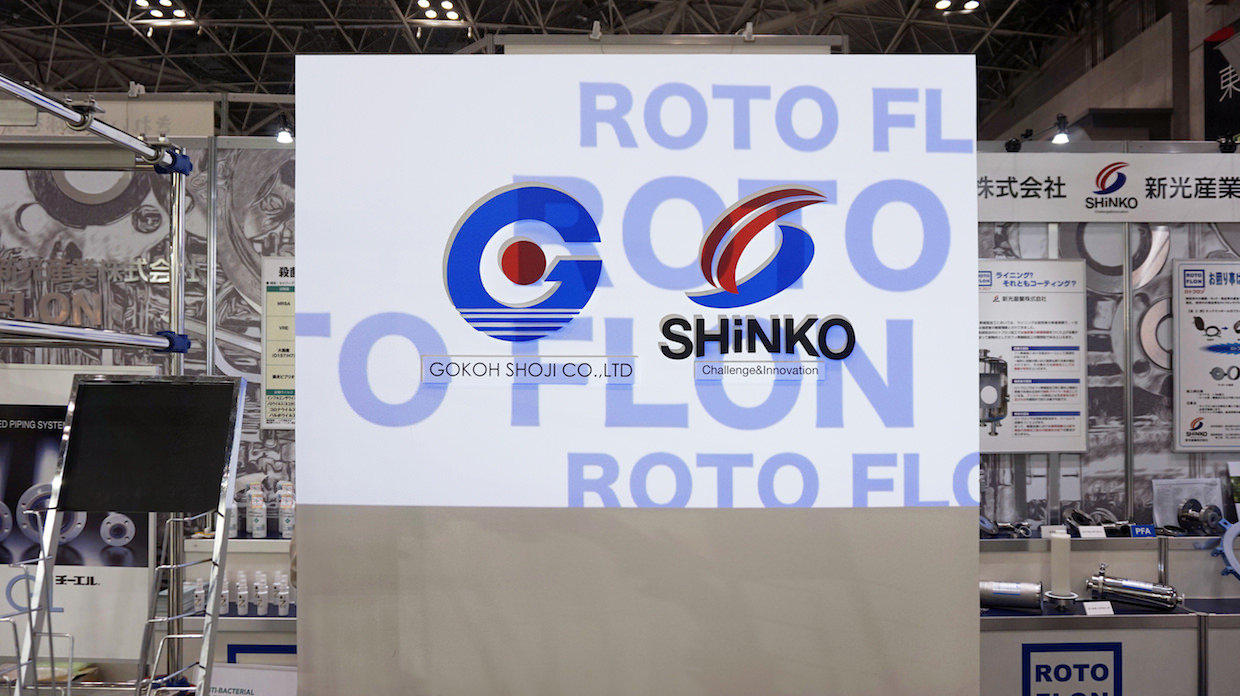
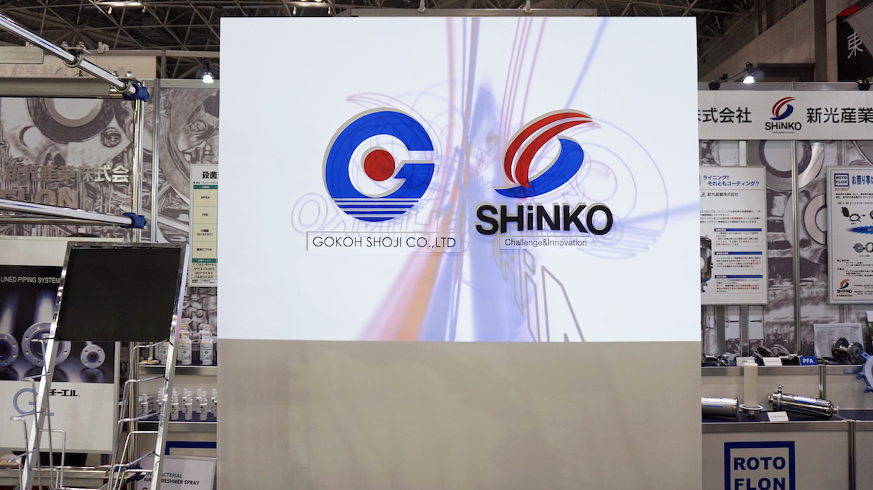
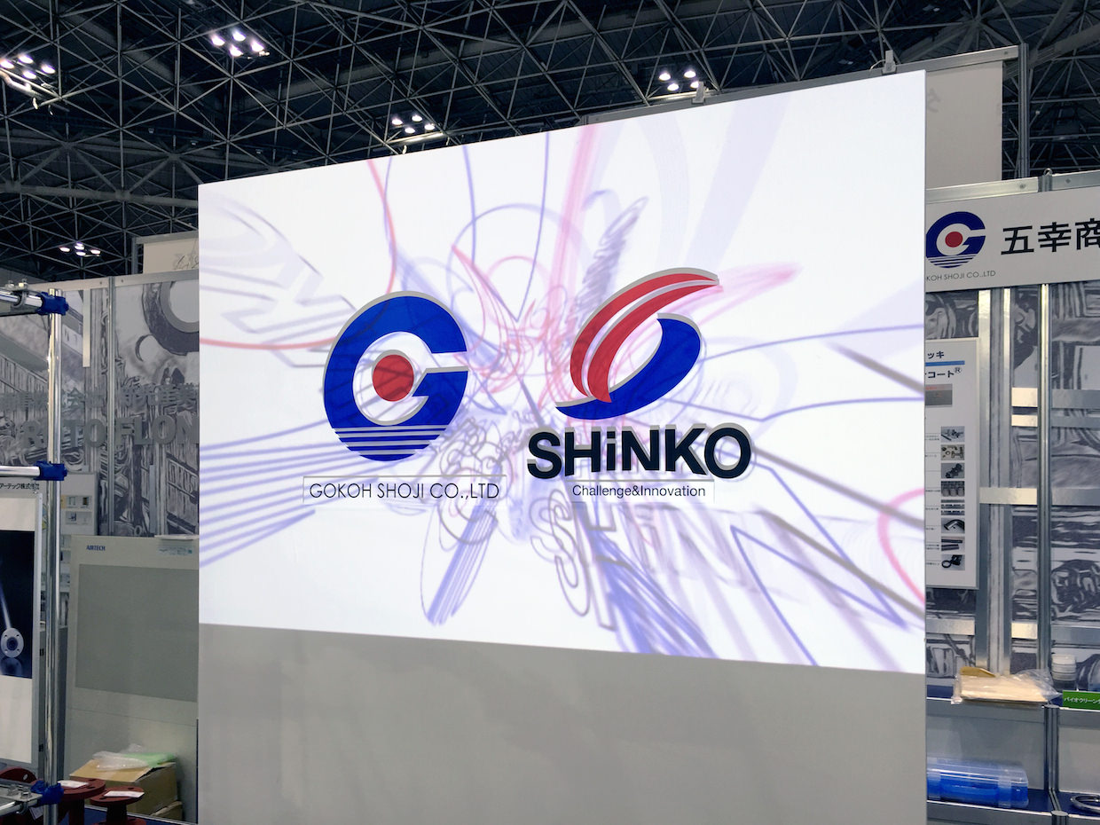
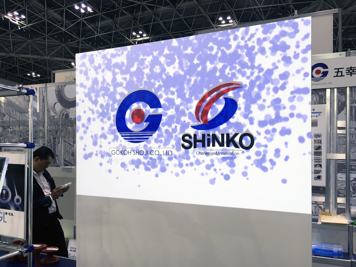
中央パネルにはプロジェクションマッピングにて、企業イメージを照射。
通路を通過する方達へのアイキャッチ効果を意図しました。
カラーリングとグラフィックデザインをポイントで効果的にレイアウトした、
シンプルながら印象的なブースになりました。
五幸商事 展示会
完成日 : 2015年11月
場所 : 東京都江東区
(東京ビッグサイト)
(株式会社プロテラス
企画プロデュース)
![](https://rojak.jp/cms/wp-content/uploads/1-10.jpg)
![](https://rojak.jp/cms/wp-content/uploads/2-10.jpg)
![](https://rojak.jp/cms/wp-content/uploads/3-9.jpg)
![](https://rojak.jp/cms/wp-content/uploads/4-6.jpg)
![](https://rojak.jp/cms/wp-content/uploads/5-6.jpg)
![](https://rojak.jp/cms/wp-content/uploads/6-6.jpg)
![](https://rojak.jp/cms/wp-content/uploads/7-5.jpg)
![](https://rojak.jp/cms/wp-content/uploads/8-2.jpg)
![](https://rojak.jp/cms/wp-content/uploads/9-1.jpg)